A little more
breathing room.
A practical guide to a calm, capable and quietly independent brand. Made for everyone bringing calmo.cloud to life.
Quiet confidence.
Real independence.
calmo.cloud gives Odoo teams room to focus. It brings the work of managing deployments, backups and monitoring into one place, while the infrastructure and data remain in their hands.

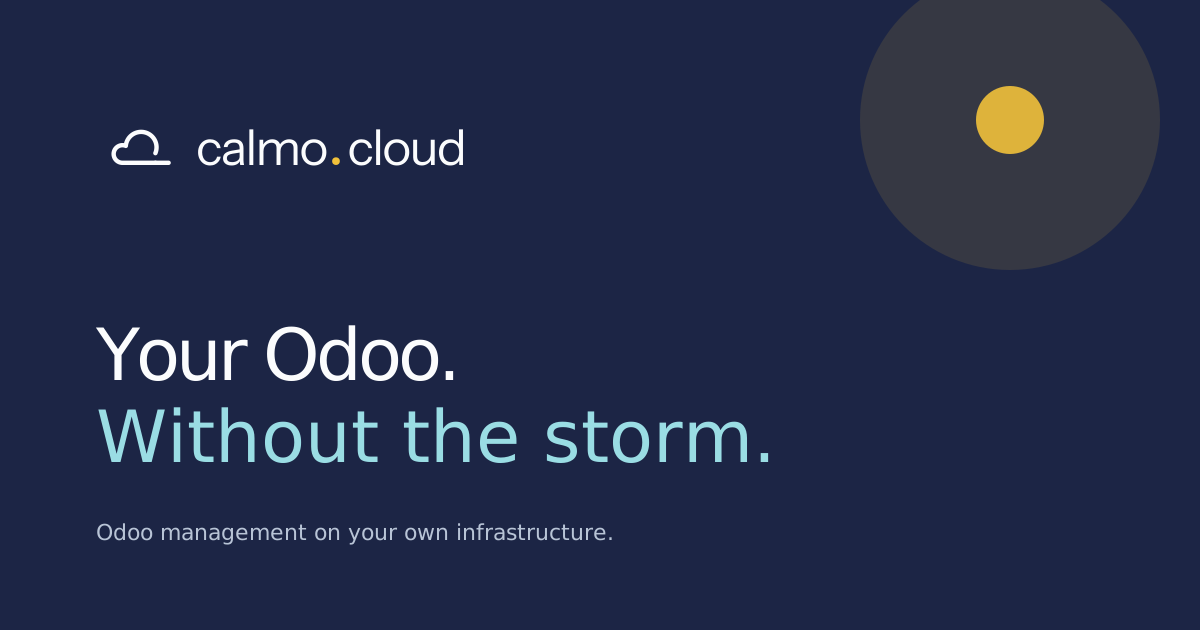
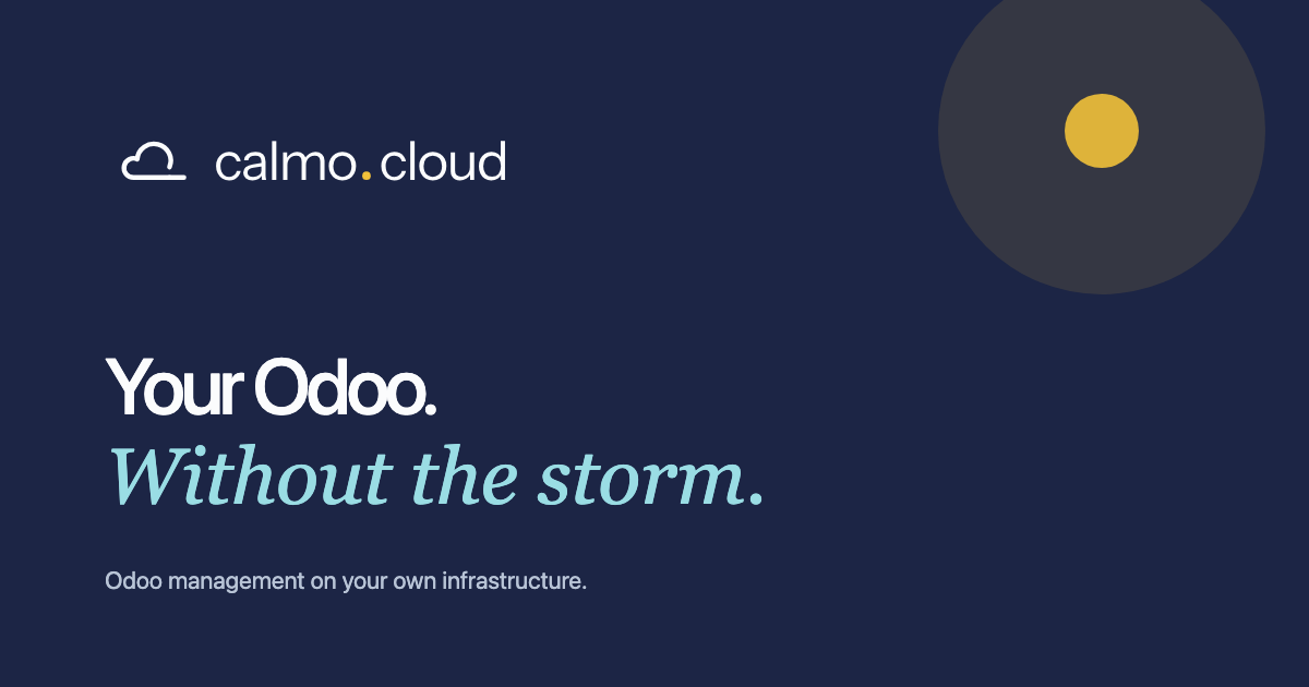
Your Odoo.
Without the storm.
Calm
Lower the cognitive load. Give people a clear view and a useful next step. Let the product earn its sense of ease.
Capable
Show the work behind the promise. Be precise about backups, previews and infrastructure ownership.
Independent
Respect the customer's choices. Their provider, their data, their access. Keep the way out visible.
| Who it is for | Odoo partners, agencies and technical teams managing their own or their clients' instances. |
|---|---|
| What we are | An Odoo infrastructure management platform, built and run by HAV Media, an official Odoo partner. |
| What we promise | Less operational overhead, with control of your infrastructure. |
| Our signature | Your Odoo. Without the storm. In German: Dein Odoo. Ohne Sturm. |
| Short descriptor | Odoo management on your own infrastructure. In German: Odoo-Verwaltung mit Raum zum Atmen. |
| Our image | The sky. Clouds pass, the ground stays yours. |
| Our languages | English at the root of the site, German under /de. Both are written by hand in the same voice. |
“Calm” describes the experience we design for. It is never a promise of zero downtime, zero maintenance or fully autonomous operations.
A cloud that
breathes out.
The mark is called Exhale. One open contour draws a cloud and then keeps going: its baseline continues to the right as a long, level line, like a slow breath leaving. The contour stays open at the lower right on purpose. In the lockup the line sits on the baseline of the wordmark, so the cloud and the name share one ground. The golden point is the dot in the name; it is the only coloured detail.
Primary / Navy + Marigold on Paper Reversed / Paper + Marigold on Navy
 One colour / print, engraving and stamps
 Compact mark / favicon, app icon, eyebrow
The name, always
Write calmo.cloud in lowercase, including the dot, even at the start of a sentence. Keep it on one line. In a URL, use the same spelling. Do not substitute “Calmocloud”, “Calmo Cloud” or “calmocloud.com”.
Give it space
Clear space on every side: at least half the height of the cloud. Minimum full logo width: 160 px or 40 mm in print. Use the compact mark at 16–48 px; never place it beside the full logo.
Keep it intact
Use the supplied SVGs. The contour stays open at the lower right, the line stays level and always runs to the right, and the stroke weight never changes. The golden point appears exactly once, as the dot in the name. Never close the cloud, add a second symbol, stretch the logo or add shadows.
Choose a clear background
Use the primary logo on Paper, Mist or white and the reversed version on Navy. The point stays #F1C13A on both. One-colour versions are for constrained reproduction. The sky illustration is a supporting element, separate from the logo.
The compact mark is the same cloud with a shorter line, centred in a square. It carries the identity where the name will not fit: browser tabs, app icons, avatars and the small marker before an eyebrow line.
Navy and sky.
Warmed by one point of light.
The palette is shared with HAV Media, so the product and the company behind it feel related. Paper and Mist give us air. Navy carries text, actions and dark sections. Teal is a live accent for links, focus and status. Marigold (#F1C13A) is the golden point and the sun; use it sparingly. Select a swatch to copy its hex value.
A useful balance: 60% Paper and Mist · 25% Navy · 10% Sky · 5% Marigold and Teal.
| Use | Foreground / background | Guidance |
|---|---|---|
| Body copy | Navy #1C2545 / Paper | Primary reading colour |
| Supporting copy | Muted #5F6D7C / Paper | Supporting text, never reduced with opacity |
| Primary action | Paper / Navy | For the most important next step |
| Editorial emphasis | Teal deep #0E7F8A / Paper | Serif accents, labels and eyebrows |
| Status | Teal deep on Teal tint #DDF4F6 | Running, ready, connected. Always with a word |
| Dark sections | Paper / Navy to Navy dark #131A33 | Ownership, footer, social artwork |
| Decoration | Marigold / any | The brand dot and the sun; avoid text |
| Dividers | Line #DCE3E8 / Paper | Decorative grouping, not the sole input boundary |
Use a minimum 4.5:1 contrast for normal text and 3:1 for large text. Bright Teal #00B0BF is for accents and focus rings, not for text on light backgrounds; use Teal deep for words. Marigold stays #F1C13A on light and dark backgrounds. Print colours need a proof for the chosen stock and profile; the hex values are the digital masters.
Clear thinking.
A human inflection.
Two voices, one rhythm. Instrument Sans makes the product precise and readable. Instrument Serif adds warmth to short editorial moments. Use the serif for a thought, not for a whole interface.
Clear by nature.
Aa Bb Cc 0123456789
Body copy, navigation, labels and the wordmark. Regular for reading, Medium for headings and actions, Semibold for the wordmark and important labels.
A little more
room to breathe.
Short headline accents and expressive statements. Always regular weight. Avoid long paragraphs, controls, pricing and dense data.
| Role | Desktop / mobile | Leading / tracking |
|---|---|---|
| Hero heading | 80–86 / 49–75 px | 1.07 / −0.055 em |
| Section heading | 48–56 / 36–40 px | 1.07 / −0.055 em |
| Subheading | 22–23 / 22–23 px | 1.25 / −0.025 em |
| Body / intro | 16–18 / 16 px | 1.65 / normal |
| Action / navigation | 13–14 / 13–14 px | 1.65 / normal |
| Eyebrow | 11 / 10–11 px | 1.65 / +0.13–0.15 em |
Speak softly.
Say something useful.
We sound like a capable colleague who has things in hand. Clear, warm and specific. Give people confidence through what the product does, and explain the next step when something needs attention.
Sounds like us
“Your backup is ready. Restore it to a copy to check everything first.”
Concrete outcome. A useful next step.Leave this behind
“Experience revolutionary, worry-free, next-generation cloud excellence.”
Broad promises without useful information.| Moment | How we say it |
|---|---|
| Homepage | Your Odoo. Without the storm. |
| Product descriptor | Odoo management on your own infrastructure. |
| Platform | Clear skies. Over everything that runs. |
| Ownership | We manage. You own. |
| Pricing | Four plans. None per user. |
| Agencies | One place for every client. |
| Deployment success | Your changes are live. |
| Backup failure | The backup could not reach your storage. Check the connection and try again. |
| Empty state | Your first server starts here. Connect a server to set up Odoo. |
| Destructive action | Delete this preview? Its database and files will be removed. |
| Early access | Join the waitlist for launch updates. |
Lead with the outcome
Explain what people can do. Introduce technical detail where it helps them choose or act.
Be warm, stay precise
Use “you” and active verbs. Sky and breath belong in editorial copy; product messages stay literal.
Earn every claim
Use real evidence. Show customer logos and quotes only with approval. Show the actual plans, Free to Agency with Enterprise on request, priced by servers and what they include. Never per user, never invented savings.
Space is part
of the experience.
An open sky, soft cloud forms and an unhurried rhythm. Light surfaces carry the content; Navy sections give it depth. Product views stay precise and readable inside that calm.
| Element | Rule |
|---|---|
| Layout | 1160 px maximum content width; 48 px desktop and 22 px mobile side margins. One clear primary action per section. |
| Spacing | Use a 4 px base. Common steps: 8, 12, 16, 24, 32, 48, 72 and 108 px. Prefer open space to extra borders. |
| Shape | 20 px cards, 12–16 px product frames, pill-shaped actions. Cloud forms are built from circles on a rounded base; never draw a cloud with hard corners. |
| Surfaces | Hero and closing sections run a soft gradient from white to Sky. Cards are white with a Line border and may carry one pale Sky circle in a corner. Dark sections fade from Navy to Navy dark. |
| Illustration | The sky illustration is layered: far clouds, a sun, mid clouds and a white cloud front. Place it at a section edge with the white front meeting the next section. Keep text in clear sky, never over the sun. |
| Product imagery | Show a specific task. Label mockups and example data. Keep real screenshots upright and readable; a slight tilt is only for editorial illustrations. |
| Photography | If needed, choose natural light, real places and an unhurried feeling. Avoid generic server racks and staged “cloud” imagery. |
| Icons | Simple outline icons, rounded caps, consistent stroke weight. Always label ambiguous actions. |
| Accessibility | Visible focus in Teal, labelled controls, keyboard-operable tabs, 44 px touch targets where possible. Status must include text; colour alone is insufficient. |
The sun and the cloud tints are illustration-only accents. They do not expand the UI palette. Do not put UI text over the illustration, use a gradient as the main identity, or turn every surface into a floating card.
One idea.
Room to travel.
A flexible identity for the website, product, social posts and print. Keep the name, the palette and the typographic relationship consistent. Let the amount of sky fit the setting.
We manage.
You own.
Your Odoo.
Without the storm.
Website
Lead with the promise, then demonstrate the product. Keep ownership visible beside convenience. Show who already runs on the platform. Every page exists in English and German; the language switch keeps the reader on the same page.
Product
Use Sans, Navy actions and restrained Teal states. Keep the sky illustration outside operational screens.
Social & print
One message, generous space, one brand mark. A large serif phrase on Navy can carry the whole composition.
Make it
your starting point.
The vector assets behind the site. Colours and type live in the Tailwind theme the website itself is built on, so the rules stay close to their implementation.

Sources and licences
- Instrument Sans and Instrument Serif: font sources and licences.
- Technology logos in the foundations band come from Simple Icons (CC0). Customer logos are used with each customer's approval.